

The Bitter End Coffeehouse Rebrand. 2025.

The Bitter End Coffeehouse in Grand Rapids is a craft roastery that operates out of a century-old reformed bank. They have been pulling shots since 2000 and remain open 24 hours. I have been a fan of their coffee for years but I always thought their logo and branding could use a refresh, one that appeals to a younger demographic but maintains the charm of its history and Eurocentric, vintage feel.
Made with Illustrator, 2025
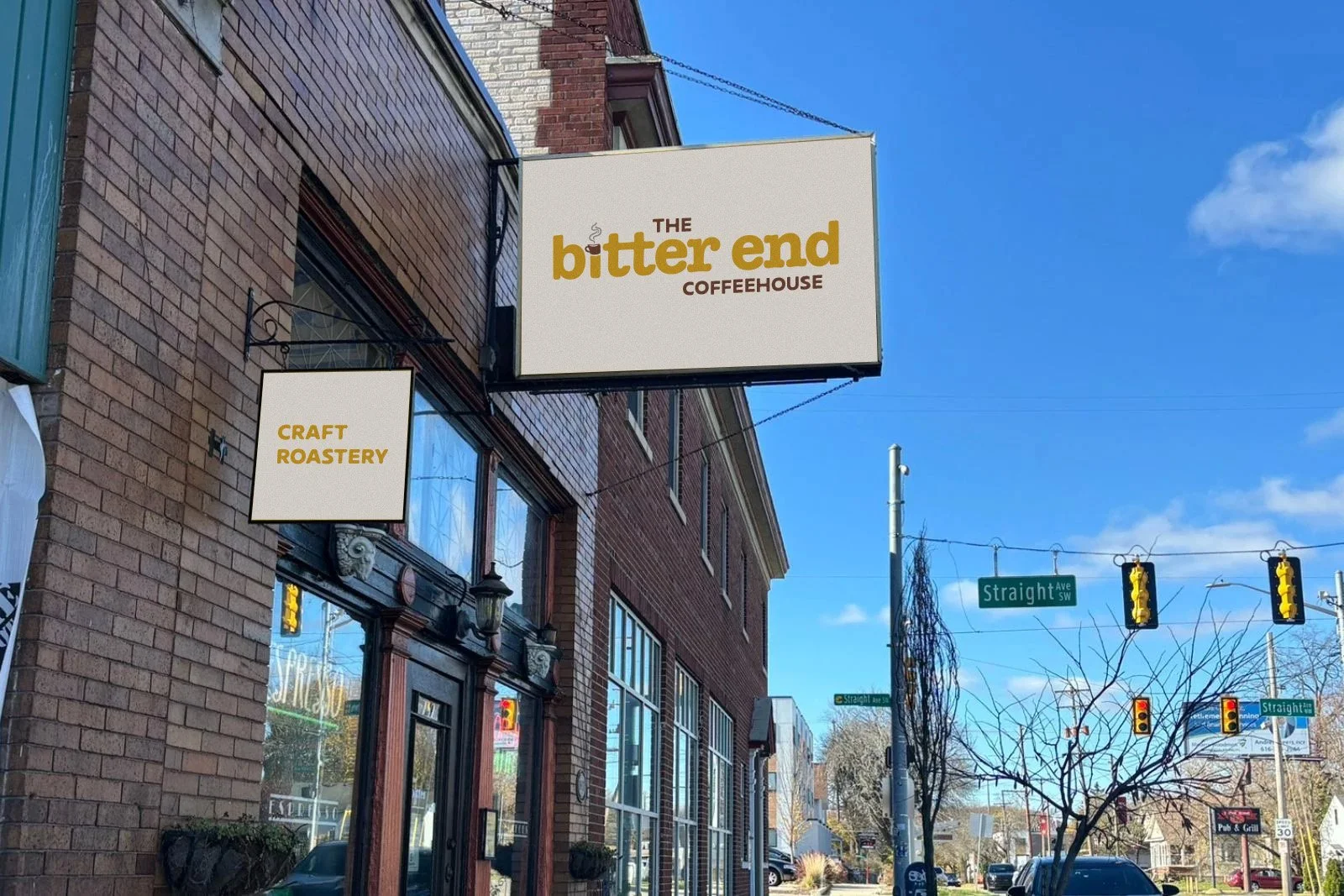

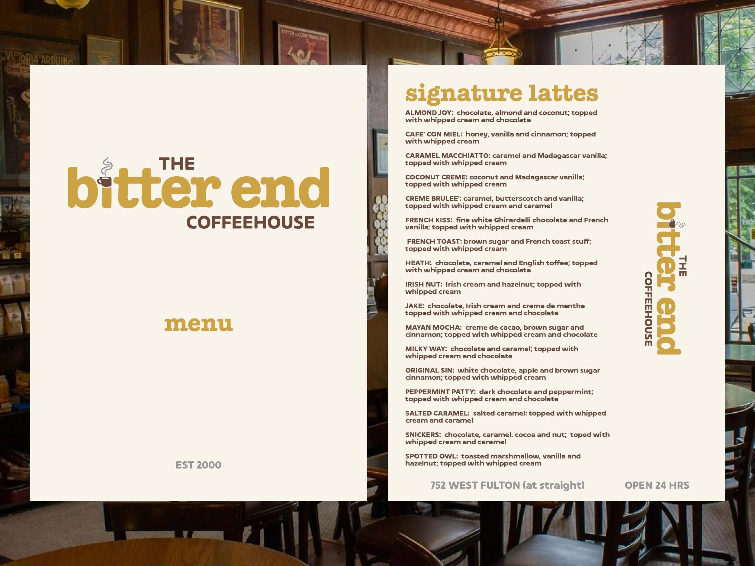
The type is a customized “American Typewriter” font. It keeps the vintage feel while giving a modern look, staying in line with the aesthetic of Bitter End.
The Type
The “i” in the title uses a coffee cup as its dot (for obvious reasons). It needed a small icon, one that is slightly unconventionally shaped, to keep with the quirks of Bitter End. Look closely and you’ll see the shape of a cigarette, hinting at the building’s history.
The “i”
The colors are adjusted from the original logo to be warmer, more welcoming, and kinder to the eye. It uses a simple combination of gold, mocha, cream, and gray.